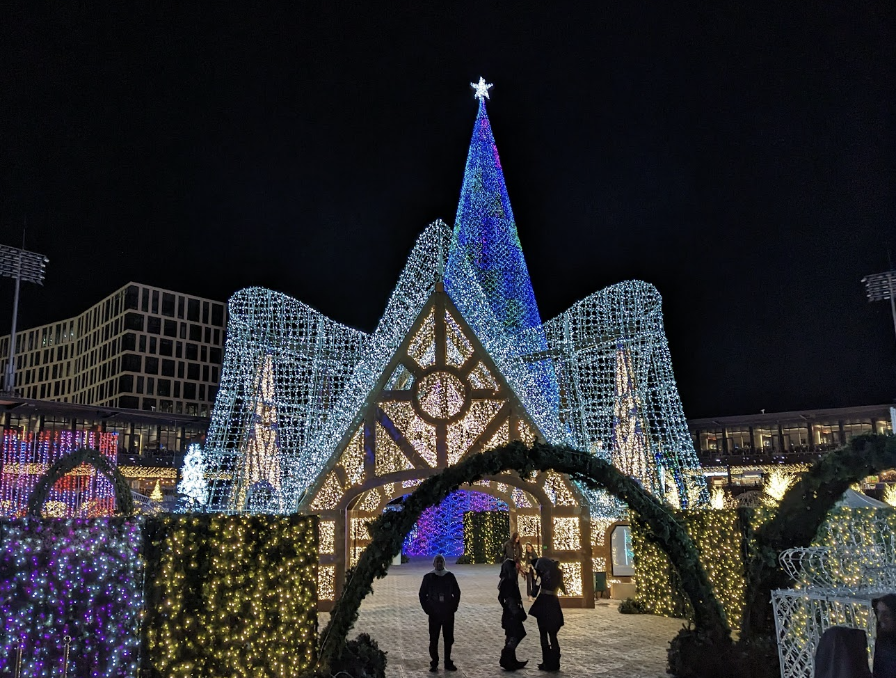
Enchant Christmas transforms stadiums across the US into spectacular winter wonderlands. With a new story each year, picture a one-of-a-kind light experience as guests weave through our magical light maze, surrounded by live entertainment, shopping, skating, and Santa.
Product Design
UX Wireframes
UI Mockups
Solo Product Designer
Website
Figma
2 Years
Product

Before joining Enchant, they struggled to create an efficient ticketing process for their guests resulting in low guest satisfaction.
Enchant's main pain points were a complicated checkout processes and poor user experience.


Tina Morgan, 37 mother with a family of 4
• Finding right time with busy schedule
• Keeping Family entertained during the holidays
• Any inconvenience in buying process will turn them away
• Ability to buy tickets with upgrades
• VIP to bypass lines and get Santa Photos
• Buy Visit Protection incase plans change
Amy Fobber, 21 single college student
• Lack of disposable income
• Decision fatigue
• Buying tickets should be painless
• Less planning, more impulsive
• Quick and seamless buying experience
• Buy the cheapest night available
• Be able to manage, adjust and change tickets on a whim


After getting a clear idea of the users' needs I was able to create some user flows using an iterative approach. We created a seamless ticketing solution to help guest buy tickets fast, then a order management system to help make adjustments to there order.

With our use cases we were able to simplify the ticketing process into 6 steps. On the right you will see a full walkthrough of our ticketing funnel.
When I first started, there was a website implemented but did not fully align with the brand. In 2022, I worked closely with our marketing team and used assets that could enhance the ticket funnel experience. Although they had branding for onsite, we had to define a style guide for all Enchants Digital experiences.

Figma File of Enchant's UI Kit

Within this kit I had to define new colours (System and States), body text, input fields and responsive components. In order to keep our Developers up to date with changes, I created a updates log in Figma as well as notion where we would track tasks.
Here is a comparison of the ticketing funnel over the last couple years. Before I started (2021) the design was simple but did not have the components necessary for buying tickets.
In 2022, I used the UI kit I created to help make accessible decisions. One example is the light gold backgrounds to help with legibility.
In 2023, our marketing team created unique medallions based on the stories that we could sprinkle throughout the funnel. We used components from the marketing landing page to add consistency between the two platforms. We simplified the background
2021

2022

2023


Manage Orders

Change Date

Purchase More Tickets